Thursday 31 March 2011

Bodkin Invitation


Roanne Adams designed this unusual invitation for Bodkin by Eviana Hartman.
About the invitation: "Bodkin is a woman's clothing collection designed by Eviana Hartman in accordance with the principles of sustainability.
The Bodkin Autumn/Winter '09 invitation influences ranged from the
designer's ideologies to the context of the presentation as well as
architect, Buckminster Fuller. The invitation arrived in the form of a
tetrahedron containing an air plant with care instructions.
One of Bodkin's green principals is to work within existing
spaces and with found materials. Therefore we held the fashion
presentation and photo shoot simultaneously at the Horticultural
Society of New York. The invite and look book were printed locally with
100% post-consumer recycled paper and eco-friendly inks."

410 BC


"410 BC is an independent, design-driven brand offering high quality, sweatshop free clothing and goods released in limited quantities. Based out of New York, 410 BC is both a clothing company and an artist collective. Collaborating with a variety of artists, 410 BC stands as a collective of likeminded individuals who strive to create unique designs, while producing goods through ethical means. The goal of 410 BC is not only to produce products free of sweatshop labor, but also to design innovative clothing free from passing trends. 410 BC has commissioned and designed clothing drawing influence from a wide range of subcultures including skateboarding, punk, hip-hop, indie and diy."
Several more images after the jump, as well as the meaning behind the name 410 BC.


"410 BC is the date that Democracy was restored in Athens. The Athenians were at war and their victory in 410 BC enabled them to restore their traditional institutions. They had a choice and they chose the route less taken, maybe the choice was a little bumpier, but overall, the end result was a lot better than any alternative. At its core, this is what 410 BC as a company truly represents, a choice. While creating sweatshop free quality clothing, 410 BC strives to design clothing with integrity."

The Manual Co. Boxes

Groovewear Special Edition Box


Wednesday 30 March 2011

Sunday 13 March 2011

Newspaper packaging

Swatch

Chicchirichi  GR112PACK Swatch Watch

similar to our concept, packaging the watch in existing forms of packaging.


Jelly Fish Chronometer  GK124PACK  Swatch


Cute Rats GE201Pack


19 degrees South 169 degrees West SUJZ105S


Hors d'Oeuvre GF112PACK Swatch


Ravage Set  GZS05PACK1


Eggsdream  GZ128PACK  Swatch

FOSSIL WATCHES

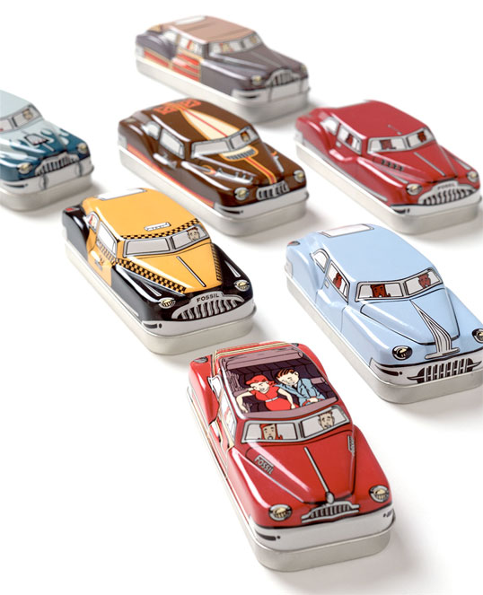
The iconic Fossil Watch packaging in a tin cube shaped box, this shape has been replicated throughout a vast range of designs and customers can select which packaging they want.


fossil

They also do different packaging designs for special watch ranges.

Crocodile Boxes


Designed by Lowe Brindfors | Country: Sweden
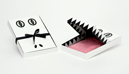
It is normally quite unusual to see anything sophisticated being designed for children’s packaging, but these crocodile boxes are both clever and engaging, with a ‘mouth’ lid which opens to reveal triangular teeth and a pink silk ‘tongue’ lining. Produced for the children’s section of a Swedish department store.

Luckipocki


Designed by Blow | Country: Hong Kong
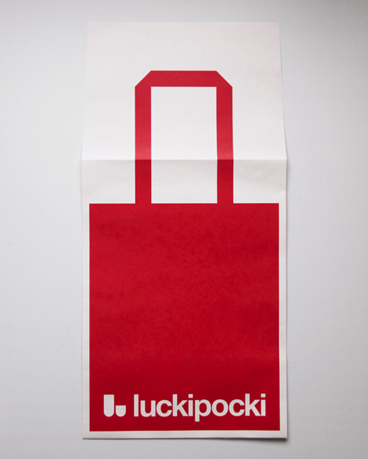
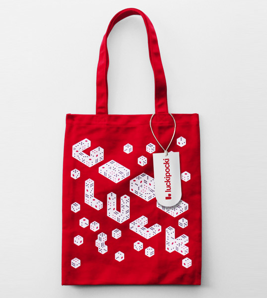
“Luckipocki is a young and fashionable tote bag brand. Their products are sold on-line. Therefore, the products need a package that can be mailed. We have designed an envelope which has a very bold tote bag graphic. The red tote bag graphic is eye-catching and clearly deliver the brand nature. This packaging can be easily recognized in a chaotic mail environment.”


Timex


Designed by Atlason | Country: United States
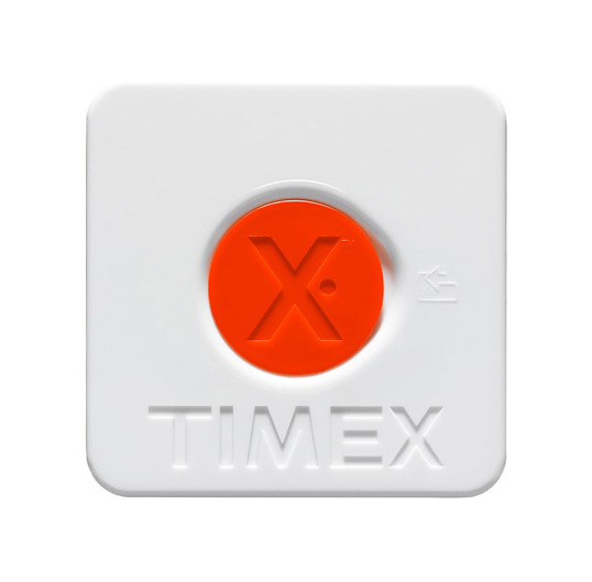
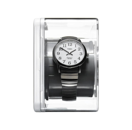
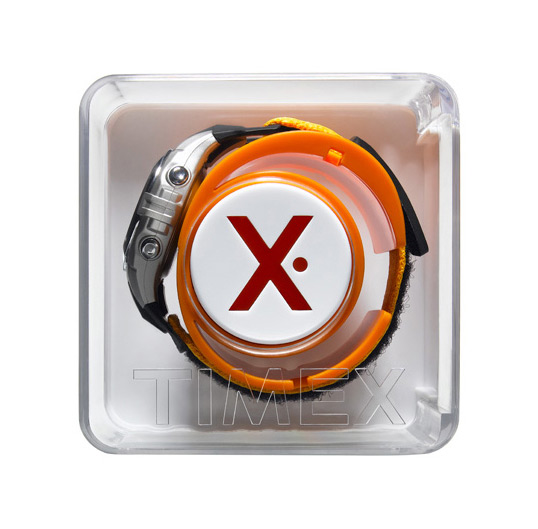
“Packaging design for Timex watches, designed by Atlason, a product design studio in Manhattan, on sale at Target stores. The packaging is made of Polystyrene and ABS with 25% post consumed material. It fits a variety of different watches with the instructions and manuals in the core behind the colored lid.
It comes in three colors and can even be be opened and closed by consumer before purchase! Different watch types can be rotated on the core axis for better viewing and fit in the package.”

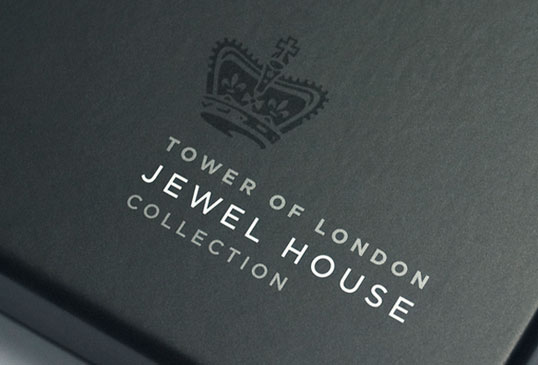
Jewel House Collection


Designed by Aukett Brockliss Guy | Country: United Kingdom
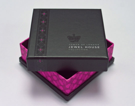
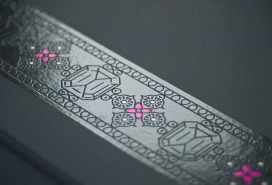
“The Tower of London Jewel House Collection is the premium retail brand for Historic Royal Palaces, which has been completely re-positioned with a unique identity and complementary range of luxurious packaging and gift wrapping products.
The iconic crown symbol draws inspiration from St Edwards Crown, and forms a powerful centre piece to the Jewel House Collection identity. All luxury gift boxes, wrapping and gift bags have been carefully designed and detailed to deliver the highest levels of quality and customer satisfaction.
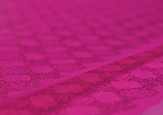
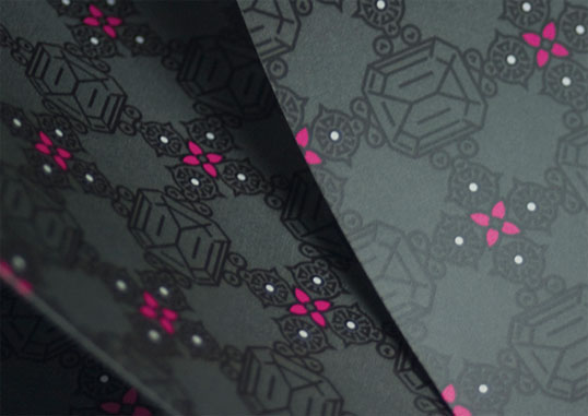
A bold repeat pattern, inspired by the Crown Jewels, is combined with an unexpected fluorescent pink colour to give a wholly contemporary twist on a traditional theme.

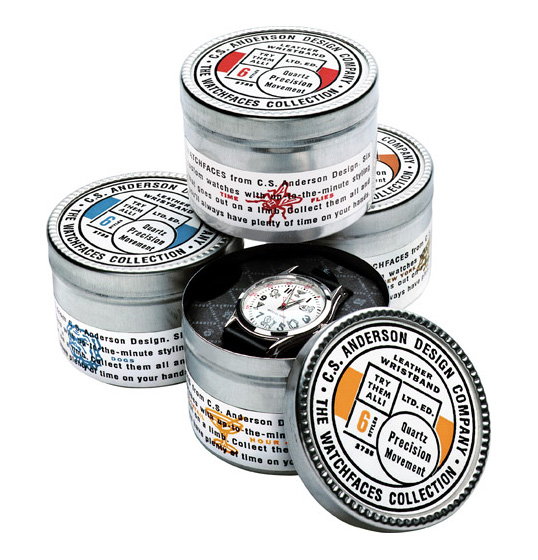
CSA Design Watch Collection

“This limited-edition series of highly-awarded, high-concept watches was a pet project of CSA Design, with manufacturing help from the Fossil Watch Company. Packaged in custom-tins with 2-color labels that were inexpensive to print but big on impact, with a clean typography treatment spiked with a pop of color and an icon representing each watch’s “theme,” which included Time Flies, Deadline, and 5 O’Clock Shadow.”


Hoxton Street Monster Supplies – Purveyor of Quality Goods for Monsters of Every Kind

Ministry of Stories follows the model of the 826 centres: a writing centre where kids aged 8-18 can get one-to-one tuition with professional writers and other volunteers; with the centres being housed behind fantastical shop fronts designed to fire the kids’ imaginations (and generate income for the writing centres).
In our case, the shop is Hoxton Street Monster Supplies – Purveyor of Quality Goods for Monsters of Every Kind.
The shop was established in 1818, and ever since then has served the daily needs of London’s extensive monster community.

The fun and light hearted nature of the names of products make them fun and attrative to customers ...strange ones maybe. I think the attention to language is something we 

Thursday 10 March 2011

Other designers work for past Ted Baker briefs.


I like the stamp idea, the queens crown is used in lots of the promotional work already.

I love the continuity of this piece but it doesn't appear quirky or fun like i would expect from Ted Baker looking at its other ideas. The main aspects of Ted Baker is its British'ness and this design does no convey that.


I like the concept, british summertime, but i think the design could have been pushed further to appear more fun and quirky, this project could have been a lot stronger if the theme was explored more.

Wednesday 9 March 2011

Ted Baker Christmas Bag


It' nice to see Ted Baker following their witty ideas into the packaging and free gifts, its a good way of attracting new customers. Packaging is very important as this is what will be seen by other shoppers and could entice them into the shop.

Tuesday 8 March 2011

Newspaper Packaging

L&Ganse communication agency designed a label achieving a surprising alliance between the British newspaper world and the wines from South of France:
"The Sun, one of the most widely sold English-language daily newspaper, has launched a “sunny wine” intended for its readers - elaborated by Maison Skalli and distributed by ASDA - for which a specific packing was required.
The briefing aimed at describing the product in its original set: a wine grown under the sun in South of France by the newspaper’s wine specialist, with a strong emphasis on The Sun arranging newspaper clippings. The expectation was to highlight the product quality and its French origin as well as the newspaper involvement, avoiding interfering with legibility.
It seems it is a success as readers gave it an enthusiastic welcome in wine departments of stores."


Lipstick
The Balm lipsticks, named after newspaper sections and packaged in newspaper print tubes.

Store location, environment.


Store competitors due to Location
Victoria Quarter


Store competitors due to Target Market
Ted Baker bucks trends
Despite poor high-street results, UK fashion chain Ted Baker has reported a 21 per cent increase in annual profits for 2004. The brand attributes its success to the "quirky" sense of humour of its designs. Great demand for men's wear appears to be an added stimulus.
Ted Baker said that the double-digit sales growth - from GBP 84 million to GBP 105.76 million - had pushed progits to GBP 16.8 million, compared to GBP 13.9 million in 2003. For the first six weeks of 2005, sales rose 23 per cent.
Ted Baker operates 21 shops in the UK and ten international shops, selling adults' and children's wear. It also sells its clothing through 600 other shops.
www.tedbaker.co.uk
21 March 2005

-The quirky sense of humour shown in Ted's designs have effected the sales in store, this shows the importance to keep the design of the ranges light hearted and quirky and follow from Ted Baker's current designs in store as they must be working.

Monday 7 March 2011

Nooka Yogurt


Packaging for watch, showing how far you can push ideas. This relates well with the packaging work we are currently designing as it is packaged food and jewellery together, creating an experience! I couldn't see Ted Baker buying into the idea of fish and chips in the shop, maybe a tad smelly :) but i like the concept.

Newspaper Packaging.

Title: Newspaper to New Paper Project
Agency: Dentsu Tokyo


Client: Ichida Garden

Credits:
Designer: Yo Kimura, Yoshihiro Yagi


Art Director: Yoshihiro Yagi
Copywriter: Haruko Tsutsui
Printer: Nao Morimi
Account Handler: Kosaku Miyata
Brand Manager: Chie Ichida


We designed a piece of packaging for the street vendor that sells farm-grown fruit and vegetables, based on the old newspaper used to wrap vegetables. A Newspaper has two benefits: its ability to retain moisture and keep vegetables fresh for longer; and the fact that it is being reused. Under the 'Newspaper to New Paper' project, we used newspapers that had been thrown away and added an element of playful and engaging design, for both those selling the produce and those buying it. As a result, the project was eco-friendly as well as budget-friendly. By simply adding dots and stripes to the old newspaper, we created a completely new packaging design.


Ck

Calvin Klein tasked Cuban American artist Anthony Goicolea to come up with the brand's Christmas window installation. Titled 'Middle Night, a short film by Goicolea', it is inspired by early 19th century toys, snow globes, dioramas, puppets and flip books


'Middle Night' transports passers by to a snowy winter scene. The action unfolds as the camera rotates around two tents. The silhouetted figures and scenes within the tents change - sometimes they are dancing or hanging stockings, and sometimes even tucking into Christmas dinner.


The window installation is seen at freestanding ck Calvin Klein, Calvin Klein Jeans, and Calvin Klein Underwear stores worldwide, but only select stores will feature the video installation


Sea Prints