Tuesday 7 December 2010

PES


TYPOphile


WOW... this video is brilliant, the materials used and ideas for the type are so creative. i love how it changes from 3d made type to computer generated type, it flows so smoothly from one phrase to another using appropriate media and use of colour.

Typophile


this is a very complex and long piece of kinetic type, there are a lot of aspects of it i like....

Gregory Vandenberg


Kinetic Typography from Gregory VanDenBerg on Vimeo.


I like the way he has extended the stems of the type to flow into new words, it is a nice way of moving and connecting togeteher

Tuesday 30 November 2010

Sony Bravia Ad

Phonogrphantasmascope

Parkour flipbook

Psychiatric Answering machine

Weidemann

Batteries not included

VW ad

I (L) NY

TYPOLUTION!

Animation Climate Change

We Must Stop- Type in motion

Type in motion- Land is mind

Human Ink

Discovery channel promo

Experimental in type!

Why so serious? Batman Typography

Batman Joker Typography

Nickleloadeon

BBC2 Idents How did they do it?

BBC 2 Idents

Idents

Film 4 Ident

Channel 4 Generic Ident

Channel 4 Ident new


Using the same concept of the moving number 4 but making it more complex by putting it within a context and making it appear real.

Channel 4 Ident


Short 4 second idents from channel 4, shows what is possible for me to achieve.

Wednesday 24 November 2010

OUGD201 -What is Good? more research on what is good blog...


http://s-oglesby0912-thisisgood.blogspot.com/

Monday 15 November 2010

Yochai Matos

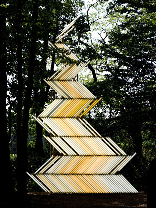
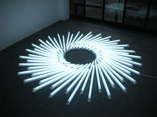
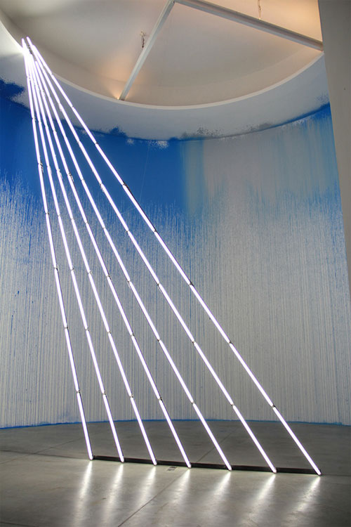
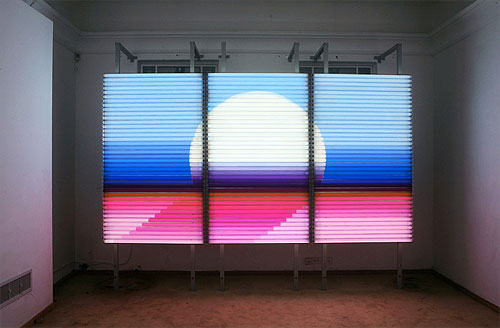
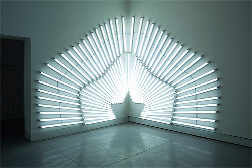
Light installations by Yochai Matos. Tel Aviv, Israel.

This caught my eye as they have used light in rays and triangles but also with organic elements (first image) such as photographing it outside. I think its really interesting and unusual and links with my work.

light installations by artist yochai matos

light installations by artist yochai matos

Wednesday 10 November 2010

Debbie Powell Ink

I like how she uses repeated patterns in print and their tribal organic qualities, it is similar to how i want to use pattern within my packaging. I really like how she uses one bold colour contrasting with wood or material (natural materials).

Debbie Powell Ink

Traditional Mandala Incense


The Traditional Mandala Incense is a bamboo tube containing the Himalayan incense sticks. The incense sticks themselves are wrapped in rice paper. The following describes the Himalayan incense......Each package contains approximately 24 thick sticks that are 8 1/2" long. The package reads..."This incense is made according to an age old Buddhist tradition to offer to all Buddhas, Bodhisattvas and guardian deities of the ten directions. It contains about one hundred precious aromatic herbs including gurgum, nagi, musk, white & red sandalwood, saffron and other excellent medicinal ingredients. It is prepared by hand with utmost care and devotion for the well being of all the sentient beings and accumulation of merit... " 
 
I would like to use this package for the incense sticks, it looks the most authentic and i think it has a beautiful quality to it, i will look at printing onto rice paper.

Tison Incense

 02_Tison_Pkg

I love this packaging as it communicates the idea of burning, which represents the incense, what is being packaged. i like the variation in colour and how each package is a different length because of how much it has been burnt. It appears real and natural.
  01_Tison_Pkg

Veronica Stark


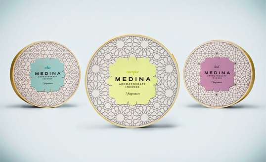
Designed by Veronica Stark | Country: Canada
The student work from Vancouver BC’s Capilano University keeps rolling in. This time Veronica Stark sends us two of her lovely packaging projects.
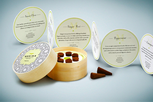
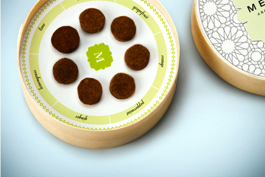
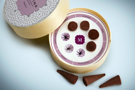
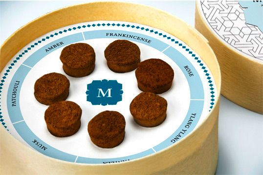
“Medina is a high-end incense company that specializes in aromatherapy multi-packs. The name was chosen to reference the ancient Middle-Eastern city from which incense originated, and also alludes to the medicinal qualities of each scent. Each container features a variety of therapeutic scents, allowing you to explore different aromas in one package. With the arabic-inspired patterns, calming color palette and modern typography, Medina is a fresh approach to incense packaging.”

I really like the complex patterns created on for the packaging, it appears fragile and beautiful

Product Range


i love the continuity throughout the range of products the bellyband stock and pattern, although the bellyband colour and the style of packaging changes it is still a strong range.
I like how some of the contents can be seen using a cut out within the packaging.
http://www.smashingmagazine.com/2008/06/02/beautiful-and-expressive-packaging-design/

Arcadia Organic Tea

This packaging was hand made and assembled by me for a package design class as part of my BFA. The pattern was lacquer transfered to green paper. They come in a package of four so placed back-to-back all the little pyramids would nest together to make a larger pyramid.
61 in Beautiful and Expressive Packaging Design

Topshop Make-up Packaging


Topshop Make Up A/W10

Design of Topshops’ Autumn / Winter 2010 Limited edition Make-Up range. 'Heavy Duty' packaging features mirror finishes, triangular boxes, die cut angles, foiling, and scribbled illustrations.

I like the simplicity of the packaging and the triangular cuts used throughout the products

100% Wood

Waiting for the Sun vs Kulte
French brand Kulte has teamed up with Waiting For The Sun to create a 100% wood, handmade sunglasses for Spring 2010. I love the triangular shape and recycled brown box packaging.

Polyhedral

I’ve been intending for a while to do a little survey of recent polyhedral packaging. Sylvain Allard, in his Packaging UQAM blog, shows a great affinity for geometric solutions to packaging problems. So it seems fitting to start with something from there.
1. Laurence Gregoire’s proposed chocolate packaging, above, features a triangular package that unwinds into a string of 10 connected prism-shaped boxes. It’s a sort of fractal pack since the shape of each part is similar to the whole. (And the logo looks like the second iteration of aSierpinski triangle.)
2. New Zealand-based Steph Baxter’s proposed “recycled tissue” packaging is reminiscent of some recent triangular Kleenex boxes. Except that, in her design, the prism-shaped boxes are tied together in a hexagonal set of six. Also: her graphics tell a 6-panel story about recycled paper.
3. Diego Hodgson’s dual Bon O Bon package is based—not on prisms—but on antiprisms. Two square antiprisms are combined to form a hinged dual-package—with each side containing a different flavor of candy. (See also: Nerds)
4. Nescafe display packaging by Alberto Vasquez of igen Design and Éva Sümegi & Richard Nagy of Co&co Communication: cube-shaped carton unfolds into a triangular (prism-shaped) POP display.

Baby Star Shoe Box


Converserpoon
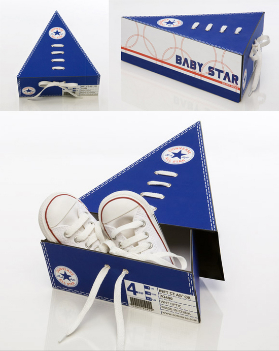
While researching Converse packaging for my previous post, I found this clever concept package by Ronny Poon: a triangular box for baby-sized Chuck Taylor All Stars. The box is held closed by a shoelace bow. According to Poon’s web site
A
fun package for toddlers’ Converse shoes. It helps improve children’s
motor skills by allowing the child to lace-up the box. When 5 boxes are
collected they can be placed together to form the Converse star.
Nice example of a close-packaging polyhedral package. And I like that business with the laced up box closure. Not sure whether this shoe box could really assist
in early childhood development, although acquiring 5 pairs of Chuck
Taylors at such a young age might help a child grow up to become this guy.

Fastcompany

People.Packaging.Packlab.

The first prize of EUR 3,000 was awarded to Hanna Päivinen from the Lahti Institute of Design in Finland for her folded, two-compartment paperboard tray, which can be made of Stora Enso Trayforma board. “The waste of food that puts a burden on the environment is reduced, since half of the contents can be used first and the other half is preserved in the tight package. This tray is suitable for the packaging of a variety of different foodstuffs, such as ready meals and cold cuts. It is perfect for smaller households and a magnificent, new break-through for paperboard, with plenty of market potential,” stated the jury.

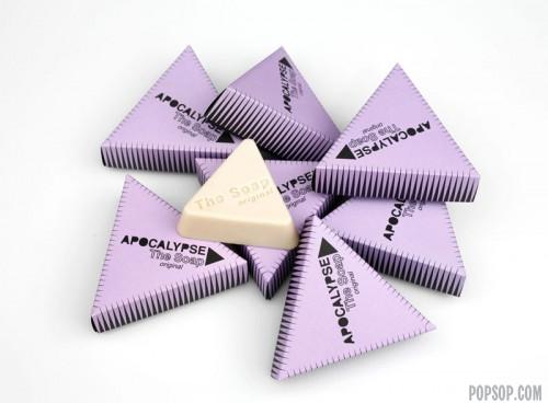
Triangle packaging for the sustainable soap

Two Swedish designers Jenny Norberg and Petra Liljas created a great sustainable product – triangle soap. It is made of recycled cooking oil and packed in paper.
Their design studio dubbed Apocalypse focuses only on 100% recycled sustainable goods.
apocalipse_thesoap

Tri-Ply's Right Triangle Box

133_boxes-in-a-row
Via Packaging Digest: a right triangle prism-shaped box for Lakeland Tri-Ply pots and pans. Designed by UK-based Nicepond, these close-packing boxes set themselves apart by making unusually efficient use of space and materials. (Also opens up a number of different display options.)
133_triangle-frontsbacksabove
(Package display options, after the fold...)
133_triplypos
Randy Ludacer

Triangular packaging samples


http://www.bayleysboxes.com/

Sunday 7 November 2010

Saturday 6 November 2010

Imagery FR


the key things i want to use are triangles, patterns and cloth.

Tuesday 2 November 2010

Pepsi


The packages contained 3 smaller boxes filled with 5 cans of Pepsi each — one with 5 cans with the logo from 1898 to 1950; another with 5 cans with the logo from 1962 to 1998; and the final one with all 5 cans sporting the newest logo.
These packages were sent to get people talking about the new pespi brand... i thought i'd show this example as i like the range of logo's they have produced all on the same product, also its a one off piece of print packaging.
I must say that i like the white cans alot better than the new blue can, i think the logo has lost all of its personality, the old red script type is much nicer although it is very similar to Coca-cola. My favourite logo is the right hand can in the box on the left as it incorporates the script logo along with the image of the well known pepsi symbol and the bottle top.


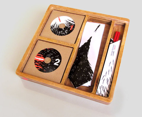
Just came across The Ghostly Store and their special edition packaging for their 100th release: Manzoku: The Ghostly Bento. Only fifty boxes were handmade, so it’s a good bet that a lot of time, thought and craftsmanship was put into this limited edition release. It’s great to see the labels/merchants get passionate about their packaging. I shall be returning to the ethereal online presence of this music label quite often.


woodstock-box-set-woodstock-40-years-on-back-to-yasgurs-farm-6cd-limited-edition.jpg The most recent Woodstock Box Set called Woodstock: 40 Years on: Back to Yasgur's Farm (6CD, Limited Edition) marks its 40-year anniversary. The 40 Years on Woodstock Box Set feautres a comprehensive 77-song, six-CD set in chronological order of performance and includes 38 previously unreleased recordings, including the Grateful Dead, The Who, Tim Hardin, Jefferson Airplane, Country Joe & The Fish, and others, and Yasgur's legendary breakfast speech. To assemble the most comprehensive document of the myth-steeped weekend, the boxed set's co-producer Andy Zax pored over every inch of multitrack tape in search of the strongest parts of each of the 33 sets. 'The way we approached all of the material was as if it was a cinema verite documentary-the raw record of the event,' Zax says. The set also boasts a considerable amount of ancillary material sprinkled throughout the discs-stage announcements, lysergic babble, the sounds of rain, a cameo appearance by Abbie Hoffman, and the graciousness of Max Yasgur's address to the crowd, heard for the first time in its entirety. Hear the best concert ever in this incredible box set!
Listen up, Ringo Beatles fans -- your holiday gift has just been located, and it's on aisle 17 in Bloomingdale's. The somewhat janky limited edition collector's box is a dream come true for fanatics of the Fab Four, packing 13 original Beatles' CDs, an engraved guitar pick, two masters and the "Love" CD -- none of which are available via the iTunes Music Store, mind you. Just 2,500 of the $795 sets are available, but -- humorously enough -- you'll be stuck ripping and transferring every last disc onto your individually numbered, etched-with-a-Beatles-logo 120GB iPod classic. Ah well, at least this scenario lets you choose your own bitrate, right?

Other than having a handmade, hand silkscreened, and autographed cd sleeve, this limited edition project definately holds weight for its musical content as well.  There are only 20 copies made.