

Monday, 7 December 2009
Thursday, 3 December 2009

Tuesday, 24 November 2009


Monday, 23 November 2009
Producing images that effectively communicate a message to an audience.

works express a futuristic world where machines control humans. We can see cities floating high in the sky on golf ball shaped clouds and numerous images connecting to war. The gas masks, bombs and machines create a chilling feel to some of the pieces and give a tainted view of our future. It repesents their interpretation of our future, one where we are controlled by machines... looking at the style of clothing and the machines it looks like this image could show how people were scared of technology and the rapid improvements being made.


French Aids poster.... This is a visual metaphor, the deadly creatures signify the deadly disease that is spreading. The people are unaware, almost blind to the risk and what it is their body is coming into contact with. It is a very disturbing piece of advertising but one that would effect you because of the powerful imagery, you would not be likely to forget about this.

This Adidas billboard shows the brand to be very environmentally concious, with a personal, rural tounch which is totally opposite to the brand itself but shows how easy it easy to promote something in a new light.

Child abuse poster, it uses simple imagery and monotone style to create a message. Black and White, facts, there's no doubt about it child abuse is wrong. The image of the hand going up inbetween the legs is extremely powerful, using an illustration has helped to make it a little more subtle as this could not have been shown as an image it is too horrific.


These are two works of Alison Carmichael, her hand rendered lettering is used a lot in advertising products, the style, colour and layout of the letters reflects the product well, the visual of the type becomes a metaphor of the product. The first image is for herbal tea, the letters are made from tealeaves and the loose swirly nature of the lettering creates a relaxing, personal atmosphere just like the tea. The mixture of type used in the second image corresponds to its adjective, not only does the type verbally describe the food but the appearance of it describes it too... without reading the type just looking at the letters we can already form an image.
Interpreting images of the present, past and a range of cultures.


These posters designed by OBEY are significant of the present and the recent voting in America, the posters are very patriotic in red blue and white and are clean and bold. This is used to promote Obama is a patriotic, straight talking guy, the bold simple HOPE type boosts the meaning of the image and supports the pose of Obama looking deep in thought... possibly hoping. The second poster has been designed in the same way creating a series of campaign posters that all back Obama, the arrows and lighting bolts my the voting box look very important and powerful and i think they would encourage people to vote!


Craig Ward created this piece of type for the Economist paper, the type layout if very specific as it is not only arranged i a circle to look like a dinner plate but the size of the type and placing of it in the circle reflects the size of the country and the position of it on the globe. I think it reflects how much resources each country is taken up.. they all appear to be crammed onto the plate showing greed of our world.

Barbara Kruger's produced most of her works prior to the massive cultural influence of personal computers and related technology. Her works are always type based, strong messages, posing questions to the audience. Her style is similar to vintage military recruitment posters from the war in Korea. Kruger always uses monotone images with bold red, black and white type.. the type with the image always poises some controvisty and a meaning deeper than what is seen.

This poster displays cultural qualities... Kelis, a well known RnB singer has been chosen to promote the 07 Ford car. Kelis has been roped in for the urban marketing campaign by Ford on the ground that the target buyer can easily relate to sharp and sophisticated style. I think the type works well against both backgrounds, good use of bold type with the word also mirroring the orange from Kelis to the car promoting the idea of being BOLD and hip.
The ability to construct meaning from visual images and type.
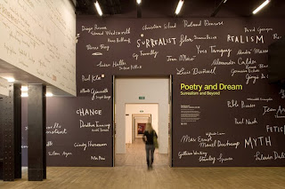
...National Potrait Gallery...
Nick Bell Design

Branch 'Petit Collage'... From a very young age, we were educated using symbols and pictograms. I think most people would have had a poster similar to this connecting the image of an animal with its corresponding Letter. It taught us to connect together words and images and helped us to learn to read and write.

Alan Fletcher's style has been used universally in maps, the simplicity of the symbols, lines and colour coding system make it easy to read and understand. Although the distance between the stations and the shape of the lines have been altered to simplify it to make it more visually appealing, we can still relate to direction and area, making it any more detailed would be of no benefit to the viewer. It is designed to be clear and legible as people reading it would usually be in a rush to get somewhere. This is an excellent piece of Graphic Design showing how the designer has covered the needs of its audience, the fact that this style has been used universally shows how legible it is to everyone.

Gerald Holtom was the designer of one of the most well known signs of today, the peace sign. This symbol was designed and used for the Campaign for Nuclear Disarment in the 60's (CND), the design of the symbol is a combination of semorphic signage representing ND for nuclear disarment, the N is made by holding two flags in a downwards V shape and the D is made by holding one flage vertically up and one down. This symbol is simple and bold and stands against so much conflict in the world, it is known universally and has united so many people.

Its funny to think of how quickly these little text emoticons spread through our everyday speech, LOL, ROFL...
Orange have created a smiley face using text symbols to advertise free texts, its bold, funny and universal.


Orange have created a smiley face using text symbols to advertise free texts, its bold, funny and universal.


Graphic Thought Facility made the branding and advertising posters for the Frieze Art Fair,


Graphic Thought Facility created the branding for Habitat homewear shop, the logo reflects the phrase 'Home is where the heart is', also keeping it in one coulour and a single line keeps it to the point, clear and simple. The members of Habitat’s Art Club received regular mailings and exhibition offers and Art Club’s publications provided members with poster-sized art images and a regular nationwide summary of art activity. The programme conveyed a consistent identity by means of an exaggerated underlining device which appeared on all its publications.

Illustrator Sara Fanelli has created an informative piece for the Tate Modern. The timeline runs along the concourse walls of level 3 and 5 at Tate Modern, providing a glance at the highlights of twentieth-century art. It informs the viewer of the artists on show within the gallery, i love Fanelli's personal quality to her work but I have to question whether it works well in this context.. is it supposed to be a piece of art in its own right?
Friday, 20 November 2009

Hat-trick

I started investigating packaging for the Message & Delivery brief, this piece was a mailshot invitation for a Interior Design company. I like how when it opens it turns into a room and the interior is revealed i think i could use this kind of idea for my own work.

Thursday, 19 November 2009
http://www.benrik.co.uk/content/

These books are amazing, i've just recently baught 'This Book Will Change Your Life' from the KK Outlet in London and hope to start it in the new year :) ..there are 365 designed and illustrated pages (one for each day of the year) with a thing to do or think about each day. some of them quite bizarre, funny, romantic and interesting i can imagine it would change how you think and act in everyday life and show you another side to life. Anyway i'll let you know how it goes, if you see me pointing the finger at you thats page 12 :) ha.
Monday, 16 November 2009
Noriko Ambe

Noriko Ambe uses books of art to develop art from, the image above is a catalogue of work by Damien Hirst that he has hand cut through the pages to create a colourful layering and pattern of papers.

This piece he uses a book of work by ed ruscha to create a sense of a liquid deconstruction.
Sunday, 15 November 2009
Ed Ruscha ..Exhibition at the SouthBank Centre
The first major UK retrospective to focus exclusively on the paintings of one of the most influential and pioneering American artists of the past half-century. Spanning Ed Ruscha’s entire career, the exhibition features 78 paintings, many on public display for the first time, and reveals the depth and breadth of Ruscha’s achievement as a painter whose interests in printed matter, graphic design, cinema, photography and the cultural landscape of the American West make his elegant and provocative work both playful and subversive.


Tuesday, 3 November 2009
Daniel Mckernan

Whilst doing the colour theory workshops i found this artist Daniel Mckernan, i likes the way he uses colour in a regimental, systematic way. This images uses RGB AND CMYK showing additive and subtractive colour. I like how he has broken up the image using blocks of colour.

In this image Mckernan uses halftones in his work and desaturated colour.
Monday, 26 October 2009
Michael Gillette


'The directive was to keep them filmic - they obviously reference the classic 60s/70s cinematic Bond rather than the 50's literary Bond. I'm aware that there is quite a difference. The films are foremost in people's perceptions of Bond, so it's understandable that Penguin would want something that will bring filmgoers to the books.'
Linda Sweenie

This type is also very similar to my 'deconstruct' letterforms, yet instead of showing plans and blueprints of the buildings it shows birdseye aerial images. It is a different approach to the idea and i don't think this works aswell, i'm not very fond of the digital images of the rooms although i do realise they are meant to look like CAD drawings. I also don't like the used of colour in this piece i think the pale blue background clashes with the colours in the type.
Kathryn Mcnaughton

Love Music Hate Racism
Designed for the Love music Hate Racism campaign, i love the use of technicolour against the washed out sepia background. The technicolour keys of the keyboard working together to produce beautiful music supports the idea of all colours, all races working together harmoniously. I love the delicate illustration against the solid block fill of the keys.
Noname Noshop

Take-out Garden
I think this is a great idea from Noname Noshop, its a paper cup with plant seeds in it and the idea is to distribute them out to people so they can grow them and then when they are ready plant them around their gardens. Its very environmentally friendly way to get people growing plants and helping our environment. The beautiful simplicity of the paper pots with small illustrations of the plants showing what the seeds will grow into.
21bis

This poster was designed for a 3day festival, i love the choice of only 3 colours being used as it tones down the busyness of the illustrations. It also works well against the block fill used on the type for the title, as it adds emphasis making the title stand out. This appears to be a print piece, i think the illustrations of the artists look cool and creative.

The back of the poster works well by just using one colour from the front, it continues on the design in a clean, clear way. It works well to display the information about the festival.
Noname Noshop

The Little Match Girl (Help-y Christmas & Help-y New Year)
Small packages were produced as christmas gifts for the family and friends of Noname Shop in 05, marking th second series of the 're-write project'. The delicate box contained a strong message, 'we can celebrate the birth of Jesus Christ but remember the little match girls'. Two matches lay inside the box carefully secured on them is written 'Help-y christmas' and 'Help-y new year' ..i thought these could be used to represent the match girls and to light a candle for them at christmas time. The small illustration of the match girl curled up in the box emphasizes the message and the tracing paper and embossed type used creates the impression of a fading memory, forgotten people. I love the intricacy of the packaging and how much is packed into a small space, it includes a list of Korean Youth families and an eempty piece of paper for re-writing the little match girl's story.
Vasava

This style of work isn't usually something that would appeal to me but it reminded me of a piece of type Fred showed me on the first day of the degree course, although his was a lot simpler it works with the idea of turning an image into type. The layers of the burger are type instead of image and represent the food that should be their, i like how they have thought about its colour, shape, consistancy when creating this. It looks really fun and communicates the ingredients well although i don't think the word 'tomato' is very readable but we know what it is from the tomato like type used.
Lowman

I have included this piece of type as one of my ideas for the summer brief was to create type from my own fingerprints to represent me. Lowman has designed this for the same reason, to show his identity in his work. It has an honesty and humaneness about it and is unique to its designer. I like the patterns created from the lines on the skin and also how it fades, i think it has a bold yet delicate quality to it.
Shotopop


I really like the work of shotopop, i find their pieces beautifully detailed, delicate and quirky. Their work enters you into a dreamlike world of soft hues and vibrant colours, loveably creatures and intricate detail. The pieces look like sets used for animations, i really like the idea of creating sets from little illustrations and photographing these to create new worlds.
Julien Pacaud

I love the use of montage within these works, piecing together papers with illustrations, photographs and found items. I really like the surreal feel to them, each piece has a dated quality due to the style and colours used.

'To prove that god is geometry, she connected herself to the machine and began to rebuild the world with combinations of parallelepipeds, polyhedrons, spheres, cones, cylinders, etc.. Here is the first cube.'
Mathilde Nivet

I was pretty shocked when i saw this as i designed a similar typeface as one of my ideas for the 'Deconstruct' lettering. By using a broad variation of building types and sizes it creates a really interesting and varied type. I think it works because they have cut around the shapes to emphasize the letterform, i really like the muted colours together.
Subscribe to:
Posts (Atom)