
I looked at a number of good editorial layouts to help me with my own layout ideas for the InDesign brief. i found graphic design magazines really helpful, grafik magazine had a really clean cut style where as IDN was very busy and compact often with lots of images making up the background to the pages. i based my layout design on a mixture of some i found in Computer Arts i found the layout really professional and creative with the right amount of text and image.


GRAFIK MAGAZINE
-they use clean looking layouts, strong blocks of colour and simple illustrations
-designers work is layed out using lots of space making it easy to view and read
-they use clean looking layouts, strong blocks of colour and simple illustrations
-designers work is layed out using lots of space making it easy to view and read

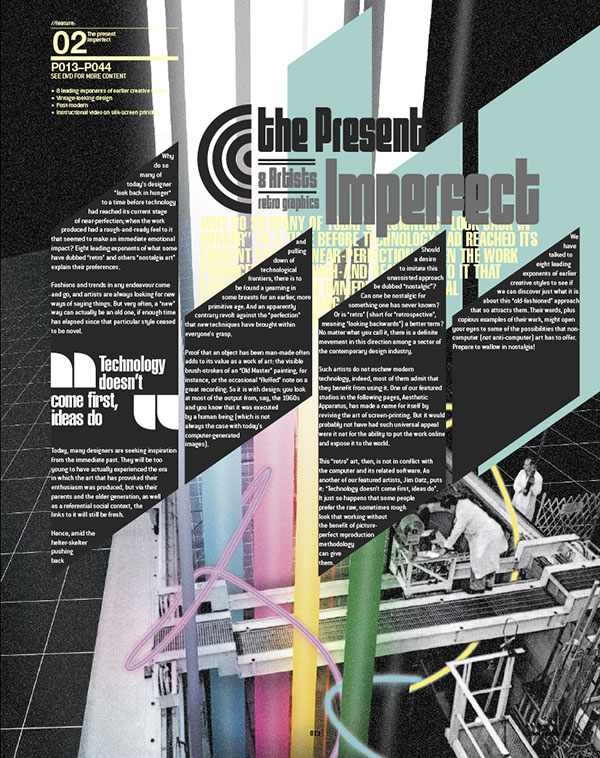

Idn Magazine
-in contrast to grafik, idn use busy geometric layout designs with lots of images and busy use of colour which works in a different way
-it is less sophisticated but more fun and experimental way of creating layouts
- they use a lot of black and white for backgrounds and text to make it easier to view against the array of images used
-sometimes overpowering for the viewer to read


Computer Arts Magaizine
-use a good balance of space and content
No comments:
Post a Comment